Crayon-style lipsticks have been around for a while, and you and I know that. But it doesn’t stop me from craning my neck at the next new one to hit the counters, because I happen to quite enjoy using these sort of lip products. I’m less enamoured with the ones I have to sharpen than I am with retractable crayon versions.
I read about the Chanel Le Rouge Crayon de Couleur lipsticks months before they became available here in Malaysia. When I first enquired, I was told that strangely, we were only getting ours later in the year as opposed to other countries who got theirs earlier. So there are many many posts out about it now, if you want to read a different viewpoint!
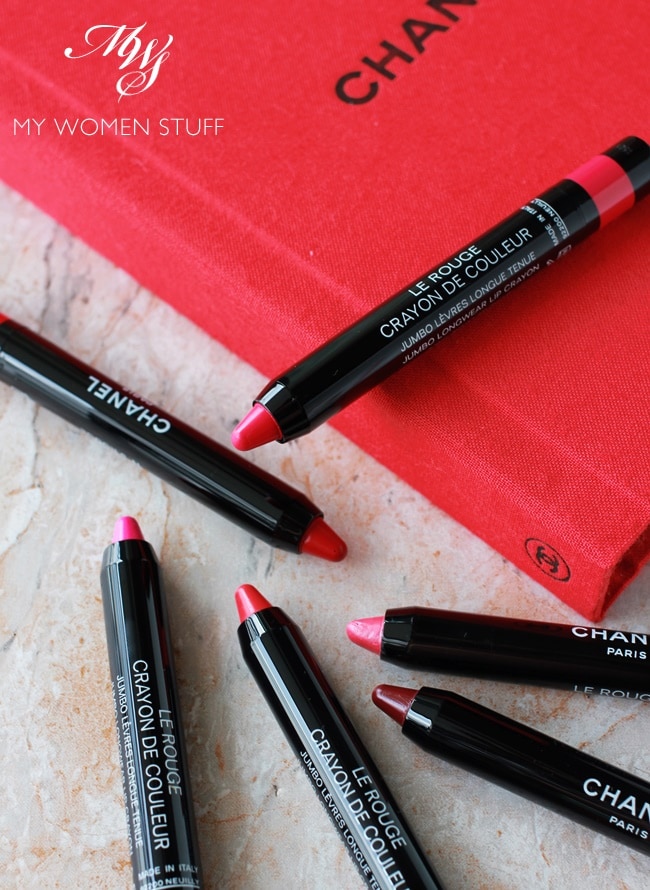
Now, you can say that Chanel is a little late to the party. Crayon lipsticks have been done over and over ad nauseum from department store brands to pharmacy/drugstore brands. But release one they did, anyway! I like that – it’s like Chanel just said, “Hey, we know this is something that’s done to death, but let’s just do it anyway!”
To be fair to them, they did do a pretty good job of the Le Rouge Crayon de Couleur lipsticks. But there were one or two things I felt might have made these excellent as opposed to just good 🙂
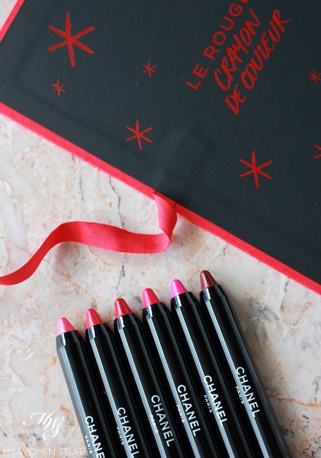
The first thing I noticed when I first saw these (at the Chanel event I had), was just how little they are. Most brands that do a crayon style lipstick go for a thicker style crayon. Chanel opted for a slim format, that likens it more to a pencil than a crayon.
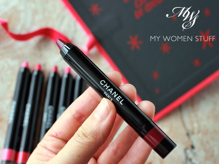
In pictures, they look quite big, but in reality, it’s really small. I can almost palm it. While I rather like the slim format (Shiseido – and some Japanese brands – do one that is similar in size although I’m not sure if Shiseido still makes them), this meant that there was not very much product available. You will run through it quite quickly.
Which brings me to my second observation. The formula is rather soft. While the sharpened tip while it’s new allows for you to draw a fairly precise line around your lips, once you use it more often, the tip will round off, and become less precise. While this does not bother me, it may bother you, if you want to achieve a sharper look, which is important when applying brighter or deeper colours.
Which brings me to my third observation. These Chanel Le Rouge Crayon de Couleur lipsticks are SUPER PIGMENTED! I was not expecting how bold and bright they are going on my lips, because most products in this format tend to be sheer. These are not by any stretch of imagination sheer. They are bold, and apply on lips as a punch of colour. I love that!
Let me show you the swatches on the back of my hand. This is just one swipe, directly from the tube.
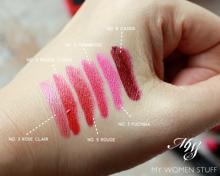
The colours are bold and very strong, pigmented and opaque. This is not a lipstick for someone who is afraid of colour (although there are about 4 lighter shades available) but I love that, because I love my colour. You may also notice that they are very creamy in texture. The crayons quite literally glide themselves on your lips , because they are so creamy and soft. Again, if you prefer a matte or sheer look, this is not for you. If you love creamy lipsticks, you will LOVE these!
Here are my observations of the colours I received:-
- No. 3 Rose Clair – This one looks a bit insipid in the tube, and looks quite safe. On lips however, I do notice that it is opaque enough to add a lovely light rose shade to the lips, that is very flattering and wearable for an everyday sort of look. The sort of colour most people will opt for, because it is not too in your face.
- No. 4 Rouge Corail – I found this to be a warmed bold red. I couldn’t quite tell it apart from the next one
- No. 5 Rouge – This looks remarkably like Rouge Corail, but when swatched side by side, and on lips, is a slightly cooler toned red. This is the sort of red I find more flattering on me.
- No. 6 Framboise – While framboise means raspberries the colour is more of a pink than a deep red of raspberries. It is a reddened pink, that is quite bright on lips.
- No. 7 Fuchsia – This is your classic hot pink. Unfortunately, a colour I shy away from, as it does not quite flatter me, and makes my teeth look yellower than they already are. I rarely wear colours like these, but I know they can look amazing on the right skin tone.
- No. 8 Cassis – This is your classic burgundy coloured lipstick. I find this flattering, if you are the sort willing to wear colours like this, but I find that the very soft formula and the sharp tip, makes for an uneven application. You have to smoosh your lips together, to get a smoother appearance on your lips.
And for an idea of how it looks when worn by me, here are the 6 colours above worn by me. The rest of the makeup is the same so you can see how a look changes as you change your lipstick colour!
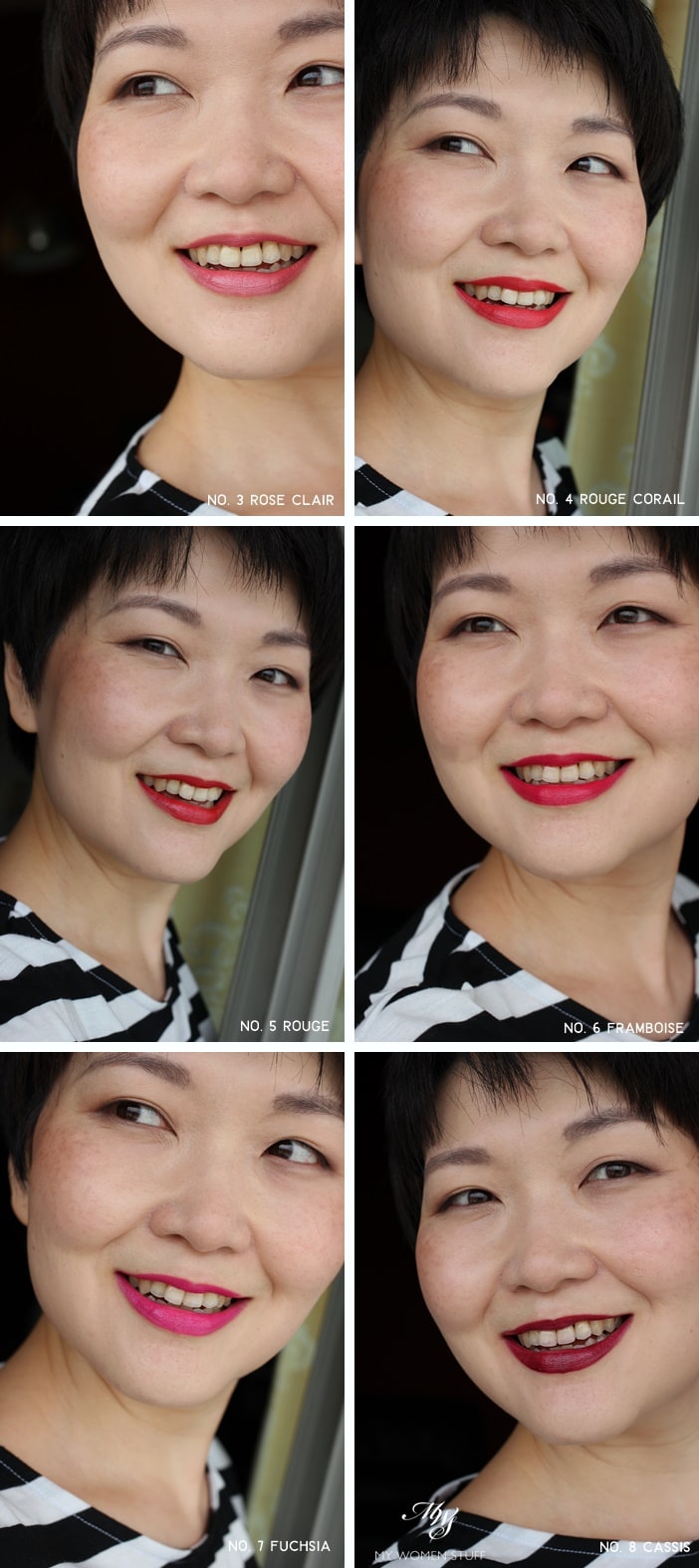
I like all the colours on me, except Fuchsia, which I find clashes with my skintone. I do find myself wearing Rose Clair quite often, because it is one of those colours that go with everything, and is enough to pull a look together without being too bold. I wear one of the others when I’m feeling bolder.
The creamy texture does feel comfortable on me, although it will transfer. But I do find the longevity quite good, and I do not find it drying. I won’t call it moisturising per se, but it doesn’t dry out my lips. In fact, in many ways, I find the formula very reminiscent of the Chanel Rouge Coco Stylo lipsticks. These feel a little more solid, but on contact with skin, it sort of “melts” into a creamy colour.
I like these Chanel Le Rouge Crayon de Couleur lipsticks, but I can understand if people are less enamoured, because of the size and the creaminess. For a lipstick in this format, I do prefer something a little more solid and less creamy, as then, the tip will stay better, and it will allow you to draw a more precise line. But in terms of formula and colour, I love them.
IN A NUTSHELL
The Chanel Le Rouge Crayon de Couleur are retractable lipsticks with a sharpened tip like that of a crayon. Like a crayon, the tip will wear down with use. I do find the formula a little soft, albeit very creamy and comfortable on lips, without being drying. The colours are bold, pigmented and opaque in one swipe, and the colours are flattering. They are quite small however, and because they are soft, will finish quickly if used often. That said, it is makeup and should be used 🙂
PROS: Easy to use and opaque in one swipe on lips, Creamy texture is flattering, Pigmented and opaque colours, Bright colours are very flattering, Portable and slim packaging
CONS: Formula is rather soft, If not careful, the cap can nick the top of your lipstick that protrudes while it’s newer
WHO WILL LIKE THIS: Anyone who likes using retractable type lipsticks, Anyone who likes wearing creamy textured lipsticks in bold shades
PRICE: RM120 | US$37 – comes in 8 shades
WHERE TO BUY: Chanel counters and beauty boutiques, Chanel online (US), Neiman Marcus, Saks Fifth Avenue
Have you tried these? Do you like using crayon style retractable lipsticks?
I have a soft spot for crayon style lipsticks, because I think they are fun to use, and I like the (slightly better) precision the tip allows me. I have found most I’ve tried to be a little drying, maybe because of the harder formula, to keep the shape of the crayon. In that sense, these from Chanel are more comfortable, but the tip will wear off faster. Conundrum! 😀
Paris B


OMG…THESE COLORS ARE GORGEOUS!!! they look great on you, too!
Thanks Z 😀 They are really beautiful colours and I’m so impressed by how pigmented and opaque they are!
Setuju!! Especially the first four colours ?
Oh hey maybe I’ll succumbed to #4 the next time I’m in KLCC
OK I have to look at Cassis now because I love deep reds. Then again, you CAN have too many deep shades like this. LOL!
When I swatched Cassis, I thought “Hmm.. I think Lily will like this one” LOL This is definitely the sort of colour you like wearing, I know 😀 The bright side is this one will wear out faster, because it’s so soft. I sometimes use a lighter gloss or colour over, just to vary the colour up a little, so it’s not so dramatic. For some reason, local people don’t like the drama – I think it’s to do with our sun – it’s too bright to be gothic 😀