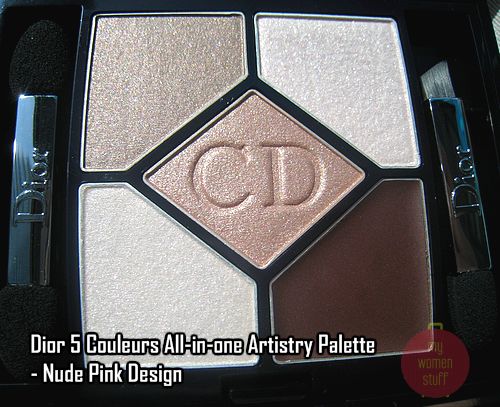
Dior Designer Palettes or Dior All in One Artistry eyeshadow palettes are a new line of eyeshadow palettes from Dior Cosmetics. Unlike other Dior palettes, the colours in each palette are gradational in tone and the texture of each colour is different from the norm. No powdery feel at all and a cream liner is included.

Today, we feature Nude Pink Design – a color that looks pink in the website but is in fact, a warmed beige in real life. A colour I’d never have chosen if it was pink and a palette I’ve grown to love for its everyday versatility.
I’m going to tell you right off the bat that you won’t see colour swatches of this palette from me. The reason is simple. 2 out of 5 colours barely show up as a colour swatch. It shows up on the lids but not as a swatch and I got tired of trying. I will instead describe the colours as best I can.
Liner – Dior Nude Pink Design comes with a brown cream liner. It goes on a bronzy shade and is dark enough to use on its own. I used it to line both upper and lower lids with it. It serves its purpose well and on the upper lid, it stayed on me the whole day. Do bear in mind I do not have oily lids. You can use your own liner brush or the brush provided in the palette – it serves its purpose.
Base Colour – The pale colour on the lower left quadrant is a base colour. You are supposed to apply it all over your lid first. The texture is a little hard and I found it barely came off on my hand. It is a very light shade with little shimmer. Using a brush or sponge works better to pick up colour.
Lid Colour – The colour in the middle is a lovely beige-neutral shade. Its the all over colour and is pigmented so it looks pretty much as it looks in the pan. The texture is soft and powdery (but not flyaway) and fingers or brushes pick up colour well. I use it as an all over lid colour.
Crease Colour – The colour in the top left quadrant is a neutral toned darker beige. It actually swatched a little bit darker than it looks and it works well in the crease or in the outer edges of the eye. I use it as such to contour. The colour texture is similar to that of the lid colour.
Highlighter – The colour in the top right quadrant is a highlighter. The texture is similar to the base colour i.e. hard but the shimmer is strong. I use it on my brow bone and on inner corners and sometimes over the lid to create a 3D look. You can skip it for the day but I use it because although its shimmery, its not disco-ball.
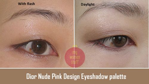
Here’s a couple of pictures showing roughly how the colour looks when applied (with flash and without):-

The camera fails to pick up the colour of Nude Pink Design for me, because its just so light and neutral and nude but you can see the touches of iridescence and shimmer. It does look better in person but its not a colour for everyone I will concede.
I however love it! I love that its neutral not pink. I love that it shows up light because it means I have found an all in one palette I can tote for serious business trips or that I can wear to serious meetings without having to worry about being over done. I love that it gives an understated look that is professional and polished. Its like my lids but better. I’d never have picked it out myself from the pictures and I prefer it to Parisian Lights now because it takes less work to make it look good and is less frustrating.
Its one of those things – love it or hate it. Sometimes bright colours are uplifting and fun; but other times, neutral colours soothe and give you the confidence and professionalism you sometimes don’t quite feel. 🙂
The eyeshadow palette comes in the signature dark blue Dior case inside a velveteen pouch for lux factor. There are some applicators included which work in a pinch.
If you work in a serious office environment, you can consider investing in the Nude Pink Design palette. Just lay off the highlighter and put it on for after work fun 🙂
I’ve since tested Amber Design, Green Design and Navy Design. Amber Design was too warm for me though the colours do show up stronger. Green and Navy too show up stronger. However, despite my love for greens, I found that Green Design fell flat on its face for me. The colours were just too blah to merit my buying it and a friend commented it was just so-so on me. I actually have a similar T’estimo eyeshadow palette in similar shades that I hardly wear due to the blah-ness. Its an Asia exclusive by the way.
Navy Design however has stayed in my mind, niggling at it now and again, pestering me to go and get it. Its a nice deep blue palette that too is pretty versatile and the colour tones in that one are more unique than green in my view.
Dior Artistry Eyeshadow Palettes are RM194 and are available at all Dior counters. I believe they are part of the permanent collection so I still have time to think about Navy Design hee hee… 🙂
Pros: Good neutral palette, Nice understated shimmer, Useful for travel
Cons: Pricey


I don’t know about this one, but the green and navy ones seem to look quite pretty. Thanks for telling that the green one looked bleh….but I am already happy with Lancome’s Renaissance Printanierre. Should check it out at the Dior counter at Parkson Pavilion. At least the SA there looks and sounds more intelligent than the ones I have met at other Dior counters.
Hi VonVon
I found the Dior green palette isn’t as pretty as the Lancome one. I prefer emerald and greens with gold highlights. Otherwise I like the texture of these palettes.
the color suits you so well PB!
Hi Nikki
You can see the color?! Teehee … thanks!
i’m not much of a Dior person so I don’t pay attention to their stuff. And they’re just next door -_- But look at that! Creme liner! they’re getting into my good books now 😀
Hi Connie
I wasn’t a Dior fan too but lately, they are making my head turn – darn! 😛
Nikki’s right, the eyeshadow looks lovely on you!
Hi Cerise
Thank you!
i like the new designer palettes a lot. the green palette i got is one of the best green palettes i have ever putchased. this pink nude looks a bit too sheer for me. the amber would be better as i am warmer than you.
however, i am most interested in the blue and the smoky (not available to us) as they are more dramatic. 🙂
i think the pink nude suits you very well. and you thought pink wasn’t your shade. 😛
Hi Jojoba
Glad the green works for you! Perhaps this works because its not quite pink LOL… I’m also still keen on the navy but am not sure about the Smokey one since I can’t see it myself before getting it 😛
Ahhh I want the green one, gorgeous!
though am not interested in Dior, but this color looks nice on you , however i still think the color is not really special , can easily find a similar one with other brands …
BTW, am new to your blog and i like it =)