Spring makeup collections usually bore me. So do Summer, come to think of it. I usually fall asleep till the Fall-Winter makeup pop up because colours start looking more saturated and bolder, and pastels take a back seat. This time around however, the Dior Colour Gradation Spring 2017 collection gave me a jolt of surprise.
Hello? This doesn’t look like a Spring collection does it?
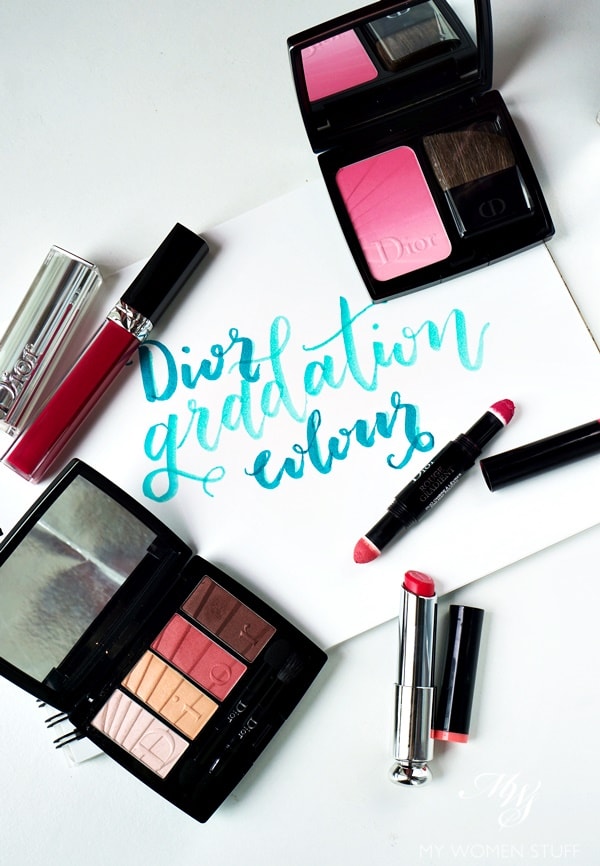
Often, for Spring makeup, Dior is the quintessential embodiment of pastel colours. Just take a look at some of their previous offerings in Spring 2016, Spring 2013 and Spring 2012. Usually, we can expect something airy, pastel and girly from Dior. Not this time. The Colour Gradation collection brings to my mind the warmth and colours of Summer (don’t believe me? Tell me that Coral Gradation palette doesn’t remind you of Aurora! Or maybe you don’t remember it HAHA! 😀 )
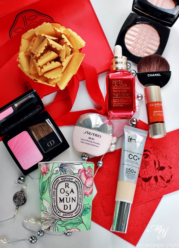
I received some select pieces from the Dior Colour Gradation Spring 2017 collection, and incidentally, they’ve conveniently fallen into 3 distinct categories – the good, the mediocre and the downright ugly. So, here’s what I think 🙂