Truth to tell, I was going to skip over the Chanel le Blanc 2019 Pierres de Lumiere makeup collection. This was more so after I was told, just after I’d received the products, that some of them are already out of stock at the boutique!
Whaaattt?!
It makes me feel a little redundant, truth to tell.
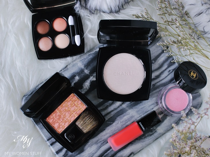
Also, I felt that the colours weren’t quite me. le Blanc collections tend to be heavy on light colours and pastels and truth to tell, can come across as insipid.
But there was one item in the collection that had caught my eye the day I saw it in the Chanel beauty boutique. It was the Tissages de Chanel blush in Tweed Beige. I thought it looked quite unique.
And then, I started playing around with the colours, and I realised that they were actually wearable, and some of the key items are permanent items. So I present to you the Chanel le Blanc Pierres de Lumiere makeup collection 🙂
Chanel les 4 Ombres Lueurs Ambrees 314 – RM244 | US$61
According to my notes, the Chanel les 4 Ombres eyeshadow palette in Lueurs Ambrees 314 is a limited edition eye palette.
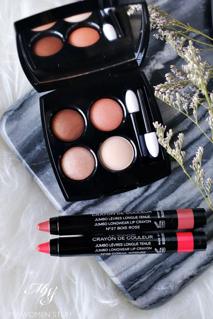
Chanel Le Rouge Crayon in No. 27 Bois Rose and No. 26 Corail Intense
At first sight, this appears to be your usual warm-toned neutral eyeshadow palette. It is quite peachy, and contains 3 shimmer shades and one matte.
I find the pale beige matte shade at the bottom right corner a little odd. When used as a base, I find that the other textures do not play well with it. It does apply a little powdery, though it does show up, much to my surprise. I rarely have luck with matte shades like this.
I wouldn’t say that I love this palette. I prefer cooler toned neutral shades for the eyes, and this one does tend to be a bit warm. However, I can make it work for me, as you can see below, in a very everyday sort of simple eye look. The brown isn’t very deep, so you won’t be able to pull deep smokey eye looks from this palette. But if you just want a simple wash of colour on the lid, this does fit the bill.
That said, so do many many other more affordable eye palettes in the market. To be honest, this one isn’t the most unique item to own from Chanel.
Chanel le Rouge Crayon – Bois Rose and Corail Intense – RM138 | US$38
You can read my thoughts on the Chanel le Rouge Crayon lipsticks in my earlier post. My view on them remains the same.
They are lovely and emollient, lightweight on the lips, pigmented and easy to wear. The slim packaging is portable, and it is a very fun lipstick to use as most crayon style lipsticks are.
The 2 colours I have are:
- Bois Rose – A neutral rose that looks a brown-beige in tube, but on my lips takes on a rosy hue that makes it easy to wear as a “neutral” lip colour. Most neutral lip colours wash me out. This one doesn’t.
- Corail Intense – As the name implies, this one’s a bright coral that brightens the complexion and brings to mind hot hot summer. Perfect for our heatwave 😛
These 2 new shades are limited edition colours, but if I’m to be honest, they aren’t so special that you have to run out and buy them RIGHT.A.WAY! But if you like the texture of the le Rouge Crayon, and you like the colours, you could really do worse 🙂
Chanel Rouge Allure Ink – Cornaline – RM138 | US$38
I don’t wear matte lip colours, unless they are made by Chanel. And I don’t wear matte liquid lipstick either, except for the Chanel Rouge Allure Ink.
I swear that they are the best matte liquid lipsticks I’ve ever worn, for the simple reason, they are flattering and do not settle into lines nor make my lips look like wrinkled prunes.
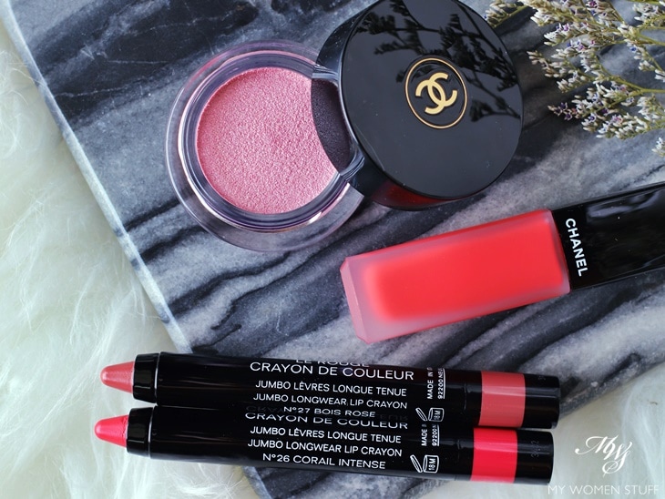
Chanel Rouge Allure Ink – Cornaline
You can read my full complete review on the Rouge Allure Ink here, but suffice to say that I love how lightweight they are, and that they do not settle nor are they drying. The colours are pigmented and they apply easily and evenly.
They do not dry down completely unlike many liquid lipsticks, and they also aren’t fully flat matte. But that’s why I like them. I like a bit of shine on my lips, and this is flattering. That’s most important.
The limited edition colour is Cornaline, which is a very bright, intense coral. Very brightening to the complexion if you are the sort to wear bold, bright colours.
Chanel Ombre Premiere Cream Satin – Pierre de Rose 846 – RM137 | US$36
That’s the pink shimmer tub that you see in the picture above, and if I’m to be honest, not my favourite colour to wear. I don’t usually wear baby pinks like this, especially if they’re shimmery, because it makes my lids look puffy and it isn’t flattering.
This one’s kind of the same. It just goes on a pale icy pink and doesn’t work for me. Perhaps I could wear it as a base and apply another colour over, but that would defeat the purpose won’t it? I’m not a fan, but if you like shades like this, I suppose it’s worth taking a look.
Chanel White Opal Illuminating Powder – RM206 | US$58
All this brings us to the more interesting releases in the Pierre de Lumiere collection.
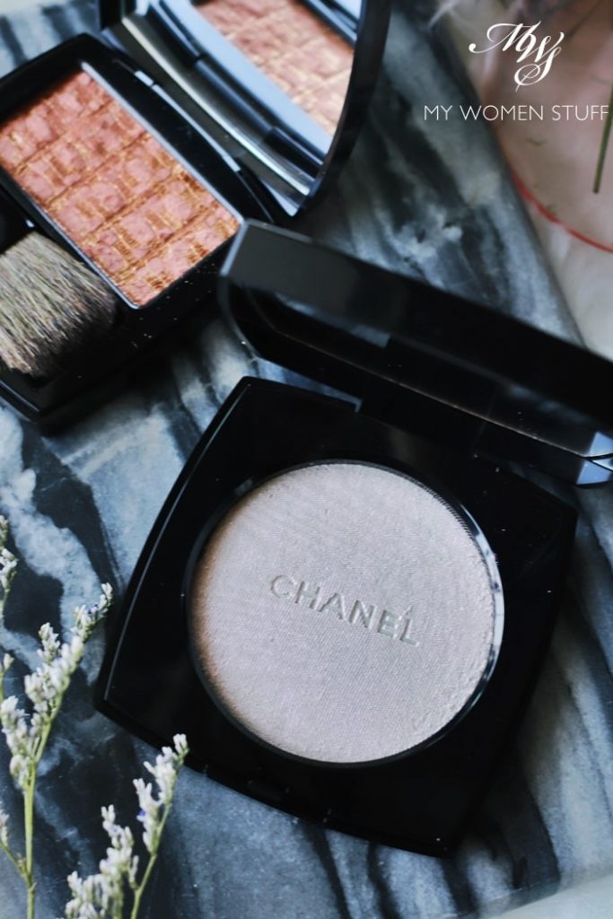
According to my notes, White Opal is not limited edition. Does it mean it’s permanent? Goodness knows!
In the pan, and in the picture, it looks like a bit of a dull dirty white powder. I swear, if it wasn’t by Chanel, I think most people would dismiss it altogether!
But as you tilt it to catch the light, you will see a bit of a hint of pink duochrome shade. When you swatch it on your skin, it shows up as an opalline pink.
What this powder is, is a highlighting powder. I do find that it can be a little intense, so I recommend using a fluffy highlighting brush (like Chanel’s retractable highlighter brush) or a fan brush.
Gently dab on the powder to pick up product, and lightly brush it where you want the light to hit – tops of your cheekbones, your nose bridge etc. I don’t use highlighter very much, and when I do, I do tend to go for the champagne coloured powders.
That said however, I do think that the White Opal powder is pretty on skin. When the light hits, the pink duochrome powder reflects itself quite prettily, and makes a difference from the blinding spotlight champage or gold shades that we are used to.
I do find also that it is quite illuminating in person. It isn’t shiny per se. It isn’t blingy, the way most golden powders are. But you will definitely notice the shine on your cheekbones, as you turn your head. It is a little like a powder version of the Illuminating Base, just a little more intense.
If you like highlighting powders or use highlighters, then this is definitely one you should look into. It is quite unique.
Chanel Les Tissages de Chanel – Tweed Beige 140 – RM194 | US$45
Being a blush fiend, I have to say that the key item in this Pierre de Lumiere collection that I was most drawn to was the Tweed Beige blush.
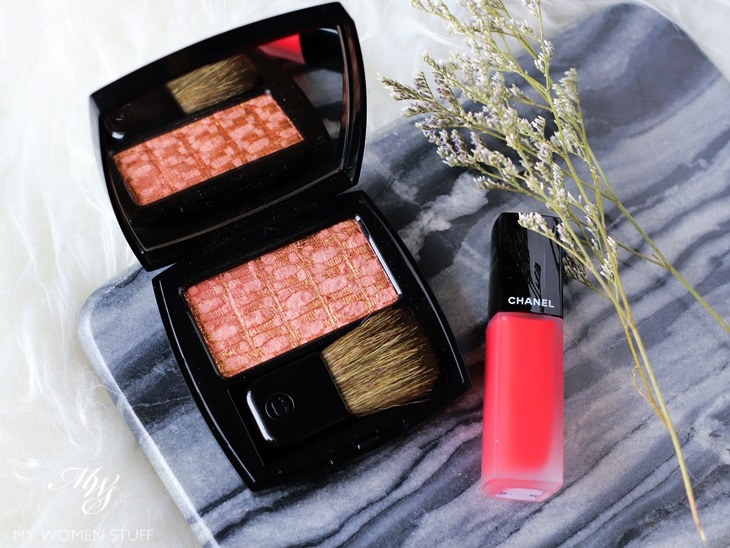
I own the Chanel Tweed blushes from waaaay back when they were first launched. They were nice, but I always preferred the Joues Contraste blushes in the round pans. These were pretty to look at, but had a tendency to have chunky glitter, and to harden quite prematurely.
I stopped paying attention to them for many years as a result.
However, I believe that the formula has been tweaked, because the current releases of the Les Tissages de Chanel blushes are very nice. They don’t have the chunky glitter bits anymore even if they are shimmery, and the powders feel soft and are pigmented.
Tweed Beige caught my eye because it is not conventionally pink or coral or berry. It is almost a flat beige in the pan, with a hint of pink, and shot through with gold.
It swatches as a rosy-beige shade. A muted rose with beige/brown tones and has golden shimmer through it. On skin, it has a golden brown colour that is quite unique.
However, I personally find the colour a little challenging to wear, because the shade accents pigmentation spots or dark spots I have on my cheeks. For some reason, it just makes it look more prominent!
I struggled with it for a few days, until I worked out that what I needed was just a very very light hand. When I just lightly dab on the colour, I’d get a neutral barely-there blush, with some golden shimmer. That looks flattering. When I’m in a hurry, it doesn’t. This therefore is not a blush for when I’m short for time, as I can get it quite wrong.
My notes also do not show Tweed Beige to be limited edition, and I do think that it is a blush colour that is quite unique and worth checking out. If you have warmer or a deeper skintone I think it would look pretty on you.
If you have a light skintone, fret not. Just use a light hand. It gives you that “Is she wearing blush?” look that I think is very modern and very pretty in an understated way.
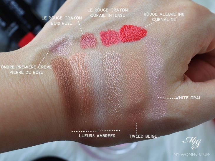
Here are the swatches of the products I’ve shown you here. As you can see, the powder colours are all quite muted and neutral. The Lueurs Ambrees eye palette is pretty but not special.
Tweed Beige on the other hand, is an interesting shade for a blush, being at once neutral but offering up a hint of colour and golden shine. White Opal Iluminating Powder swatches pink, which makes for an interesting highlight.
What would I pick from the Pierre de Lumiere makeup collection?
Personally, I’d take a look at either the Tweed Beige blush or the White Opal Illuminating Powder. Both of these are quite unique and have a beautiful texture. They do not settle into pores on skin, and do not make pores look enlarged (unless you pile it on).
I’d also consider Bois Rose le Rouge Crayon, because it is a flattering neutral rose shade and from experience, neutral shades that flatter are not easy to find. This one’s more rosy than the Rouge Allure Velvet in Nuance 71 that I showed you before. That one would be touch and go, but Bois Rose is much more flattering.
I’d also look at Cornaline from the Rouge Allure Ink collection, because I like the formula and I think the colour is pretty, although it is very bright. For the eyes though, I’d save my pennies for the upcoming Les Beiges Ombres 9 Eyeshadow palette. That one looks to be a beaut! 😀
For an idea of how I’d wear the products from this collection, here are a couple of looks showing the different lip colours. The rest of the makeup remains the same.
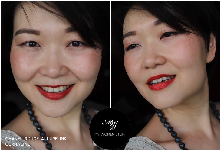
The makeup used: Chanel Sublimage le Teint foundation, Nars Soft Matte concealer, Chanel Boy brow pencil, Les 4 Ombres Lueurs Ambrees eyeshadow, Les Tissages Blush in Tweed Beige
I used Tweed Beige blush with quite a light hand for this. A base with higher coverage also helps make it look a bit more flattering, if you have pigmentation spots on your cheeks like I do, as the blush can accentuate the spots.
You may notice that Cornaline lipstick looks a bit different at different angles. It is more orange-coral and quite bright. But not so bright as to make teeth look yellow, which is important.
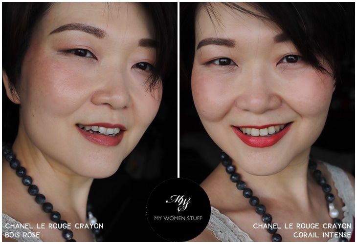
The same makeup as above, from different angles, except for the change in lip colours. There is a hint of White Opal illuminating powder on my cheek but honestly, it is a) too much shine because Tweed Beige already offers a golden shine and b) not so discernible if you don’t pile it on.
The 2 Le Rouge Crayon colours are pretty, and I like Bois Rose because it is, for me, a wearable neutral. A little plain in a neutral face as I did here, but nice for an understated look. Corail Intense perks up the complexion a little more (and that’s why I enjoy wearing a bright lip!)
Did you check out anything from the Chanel le Blanc Pierres de Lumiere collection? Which would you pick?
Paris B


Definitely eyeing the Tweed Beige, it’s very pretty to look at and has a very unique colour for blush!
That I fully agree! We don’t see many colours like this very often in blush, especially not with that lovely golden sheen!
I love the Bois Rose on you too. It goes really well with the rest of the makeup. A very refined and elegant look.
Thank you 🙂 It’s been interesting for me working with neutral colours like this, because they are so not me LOL!
reading your thoughts on tweed beige just killed off my desire to buy it d, since i do have fair bit of spots n freckles and don’t think i want to spend time to make it work on me.
ok money saved. better buy dior lipstick ady hehehe
Oh dear 😛 But who knows, maybe it’ll work on your colouring? Haha 😀 I can bring mind and let you check it out next time I see you if you like – if you do like it, then maybe you can pop along to the store 😀
#evurl enabler! lol
Thank you for your thorough review and the beautiful pictures. I recently picted up the highlighter and blush and love the effect the give. I am light with rosy undertones. I was very interested in your comments on Rouge Allure Ink. How does it compare to Armani Mastro Magnet or YSL Tatouage? Those are my two go to brands that do all that you describe of the Ink only dry down completely with no transfer. I would love your thoughts!
Hi Lisa, I’m afraid I haven’t tried either the Armani Maestro Magnet or YSL Tatouage. I previously shared my thoughts on the Rouge Allure Ink alone in this post. I will have to say however, that based on my experience, anything that dries down fully and does not transfer is usually too drying for my preferences. I usually stay away from liquid lipsticks, for this reason 🙂 In the end, I’d say it comes down to a personal preference. If you enjoy using the Armani and YSL, you may still like the texture of the Rouge Allure Ink, although it might feel a little light for your preference 🙂