Look who’s late to the party! Me, that’s who! LOL
We’re in Fall/Winter mode in the cosmetics world, and here we have, a product released by NARS as part of their Spring 2015 collection. But what the hey, it’s a permanent product, so you can still buy it if you like. Besides, friends in the Southern hemisphere are just coming on Spring… so I’m still on trend… somewhere in the world! LOL!
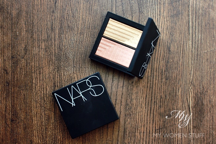
The Nars Dual Intensity Blush is a blush counterpart to the dual intensity formula of eyeshadows they released to high acclaim some time last year. I’d never used any of them. Thought about getting the eyeshadow palette for a while but eventually passed. Each blush comes in a set of 2 shades that allows you to blend as you like.
But what makes this formula somewhat unique, is that Nars made it so it can be used wet or dry, and you get two different intensities of pigment and colour this way. Hence the name. But to use a blush wet? Gosh…. I can’t imagine it, can you?
While I understand the concept of using eyeshadow wet for stronger intensity of colour, I couldn’t get my head around using a blush wet. When I asked a Nars makeup artist how that would work, she explained it thus:-
- Dampen your blush brush by spritzing some water on it.
- Brush the damp (not wet please!) brush over the product.
- Apply to skin and blend out
Depending on the colour you pick, and how much product you pick up, the effect will either be a) more intense colour payoff or b) a more transparent “watercolour” effect. Demonstrated on the back of my hand, it looked intriguing albeit splotchy. Attempted at home, it’s a mess.
So, let’s just say that unless you’re the adventurous sort, just stick to using this dry, because it serves up pretty good pigment anyway, and you don’t have to faff about with damp brushes and what-not. In fact, I think it’s far more flattering when used dry because of the softer, more luminous effect, rather than the splotches of colour you get when using it wet.
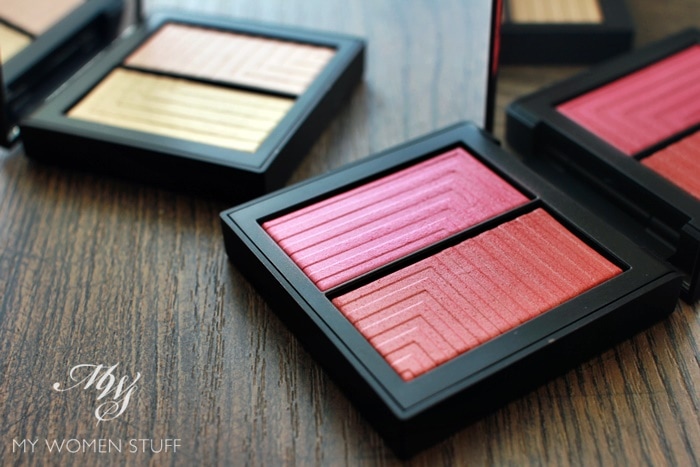
The 2 shades I was gifted with, are a study in contrasts.
- Panic which is pictured in the foreground, is a bright pink on one side, and a warm red on the other. This one is a straight blush, and fairly pigmented. For those with fair skintones, you need a soft, fluffy blush brush and a light hand or I swear, you will find it is too much. But for those with a deeper skintone, I think this will be perfect, because it will give your skin just that right amount of blush-flush.
- Jubilation, in the background, is a warm gold on one side, and a nude-peach on the other. This one I use strictly as a highlighter. While not highly shimmery when I use a soft fluffy brush, you can amp up the highlighting effect by using a denser brush.
Here are the swatches on my arm, dry – I’m a Nars Foundation in Light 2 Mont Blanc for reference, and these swatches were done with my fingers. Pretty intense, and I hardly even scratched the surface of the blushes! The product feels hard, but the colour comes off quite easily onto brushes and fingers. It does remind me of a cake of watercolour you know 😛
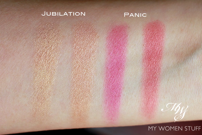
I don’t wear Jubilation a lot, because I’m not really into the whole highlighting thing. But it is fairly subtle and not very shimmery or glittery at all, which makes it actually quite wearable.
As for Panic, I tend to wear the pink side most of the time, because the warm red side doesn’t flatter my skintone as much, and in fact, makes my skin look blotchy. If you have a pigmentation problem like I do, then colours like these will emphasize your pigmentation and make it look worse than it is. Sometimes, I blend the shades, but the colour does turn out a little deeper than I like.
For an idea of how these blushes look on my skin, here’s how I usually wear it.
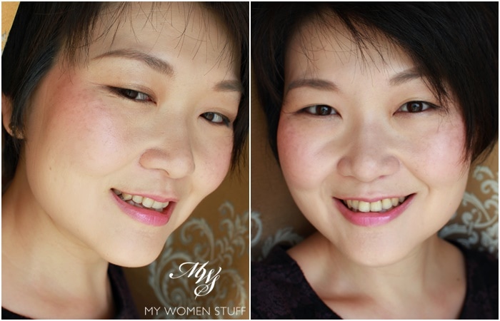
In these shots, I wore just the pink side of Panic, applied with a light hand using my Lunasol Cheek Brush, which is soft and fluffy enough, and rigorously blended out to soften. I also applied some of the Jubilation on the cheekbones for a touch of highlight. Nothing too noticeable.
Some days, I get it right, and it comes out looking soft and flushed. Other days, I get it wrong and I look like someone slapped me, or worse, I look like I didn’t know how to apply blush, with 2 splotches of colour on my cheeks.
So, if you’re wondering if I like these, I’ll have to say that I’m on the fence. On the one hand, I like the intensity of colour, and easy blendability of the product. You can buff and buff, and the colour doesn’t disappear, but looks much more natural.
On the other hand, I feel that it’s a bit too much work, especially if you aren’t as dab a hand at using blush or makeup, or if you don’t own a soft fluffy blush brush. As for using it wet, I honestly wouldn’t bother.
IN A NUTSHELL
The Nars Dual Intensity Blushes come in a compact with 2 shades that you can use alone or blend. They are formulated to be used both wet and dry, although I find it a little too weird to use a blush with a wet brush. Errors abound, and it goes on splotchy. I find the colours fairly intense when dry, so there’s no real need to use them wet. As they are fairly pigmented, I’d suggest using a fluffy brush and a light hand to apply, and build up colour as you need. Also, gently buffing it into your skin gives a nice luminous flush, as the product isn’t very shimmery, yet gives a nice glow. Longevity is good for my normal-dry skin, lasting pretty much all day. I think these are particularly good for those with a deeper skintone, as the colours are quite intense and pigmented. For the very fair, be gentle. I’m not in love with either of the shades featured nor any of the shades in the collection as I feel they swing too wildly in the extremes of shade, tone and intensity. The packaging appears to be improved from the regular rubberized NARS packaging but it remains to be seen if it’ll degrade and turn sticky after a while. I can’t quite tell.
PROS: Pigmented and intense colours, Not powdery, Packaging is sturdy and compact, 2 colours in each compact makes it versatile to use
CONS: The concept of using it wet is just too weird, Due to the intensity of pigment and colour it is easy to overdo, Pricey
WHO WILL LIKE THIS: Anyone who is familiar with and comfortable using blush, Anyone who wants more intense and pigmented blush shades especially if you have deeper skintones
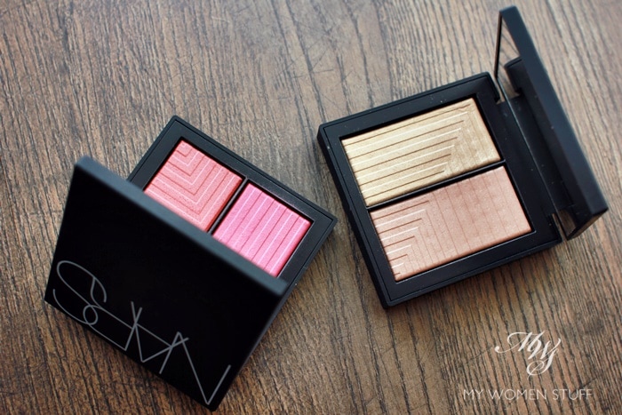
The new packaging does deserve mention though. I find that they feel less rubbery, and are more sturdy and feel less fragile. I don’t know if it will degrade as time goes on, so I’ll update if it does. It does attract dust and dirt so if you’re anal about keeping your products clean, avoid at all costs. You will go mad trying to keep it clean 😛
Did you try these Nars Dual Intensity blushes, or were you intrigued by them? If you tried them, which colour was your favourite?
While I like the luminous effect I get from these blushes, the shades I feel, can be improved on. For now, they are just too much of a contrast, or just too bold. Above all, be sure to equip yourself with a soft blush brush and blend, blend, blend! 🙂
Paris B
NARS Dual Intensity Blushes come in 6 shades – Panic, Jubilation (pictured here), Fervour, Frenzy, Craving and Adoration Price: RM191 | US$45 Availability: NARS counters and stores online (USA), Sephora (USA)


i’ve always felt like the odd one out for not liking NARS.. now you’ve said something i’ve never dared to say! their formulas are meh and i will seriously not buy anything from them again because all their rubber cases have degenerated into a sticky mess in my drawers. i’ve swatched these ones at the counters and they feel a tad frosty to me too.
Oh yes, their rubber packaging is really crappy. I have been told time and again they’ve improved on them, but it’s always the same. So I am staying away from those, which means from most of their products! While I won’t say all their formula is meh (I do enjoy using their concealer and Sheer Glow foundation) in the face of other brands out there, they could do with improving on the texture of their products. I have to admit they do strong colour quite well, which is why I feel they appeal to makeup artists who need the makeup to show up. But for day to day, sometimes, it’s just too strong. So, I’d say it’s a brand with a lot of hits and misses, but that packaging? Definitely a gigantic miss.
I never picked these up! Thought they were interesting, but read some reviews saying these are a little difficult to blend. I gather it’s the intensity of the pigments?? Would love to know if this new packaging is better though. The old rubbery ones drive me nuts. LOL!
Blending is easier I feel if you use a fluffy brush. Anyone who tries it with a dense brush head will cry LOL I’m waiting to see how the packaging holds up. I have noticed that the new items seem to come in plastic packaging, and the Audacious lipsticks have a metal-feel packaging so perhaps they have finally wised up and moved away from that horrid rubber 😛
Ooh, I’m liking the sound of that packaging! Here’s to hoping it holds up over time.
I always thought these were called duo intensity blushes because they each contain two shades (one usually darker/more “intense” than the other), but that watercolour thing sounds cool! I’d love to see a well-formulated version of that from a brand someday, lol! :p
You could well be right, Rae, who’s to know?! Have you heard of the Watercolour blushes by Daniel Sandler? I hear they are like this – a light wash of colour on skin. I haven’t tried them though! They seem quite finicky 😛