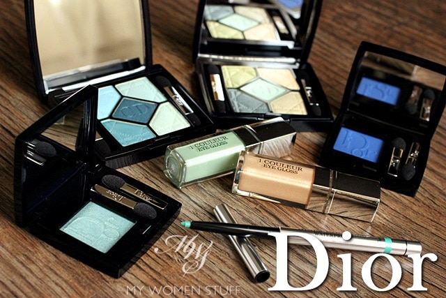
Dior’s Summer 2013 Bird of Paradise offering was so big, I couldn’t do an overview as I did for their previous Spring and Diorsnow collection so you might notice that I’ve been breaking it up a little. I did the Jelly Lip Pens and the Paradise Duo in Pink Glow together with the Summer Blush Brush in the past 2 weeks but when I came to the eye stuff, I realised I could put them all together in one post! So hurrah! Feast your eyes on the eye products of the Bird of Paradise collection! Aye, aye! 😉
There’ll be lots of photos and swatches to give you an idea of how they look, and some tips on how to use the products, so sit back and enjoy the ride 🙂
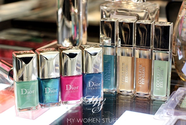
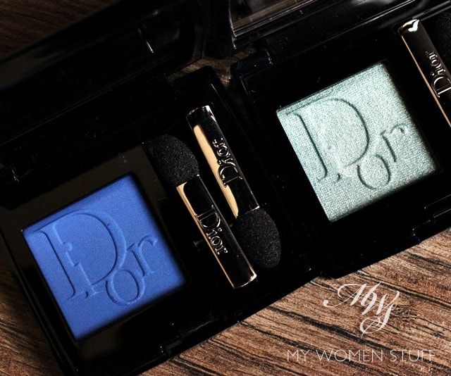
Dior 5 Couleurs Eyeshadow Palette – Peacock 434, Blue Lagoon 374 – RM210
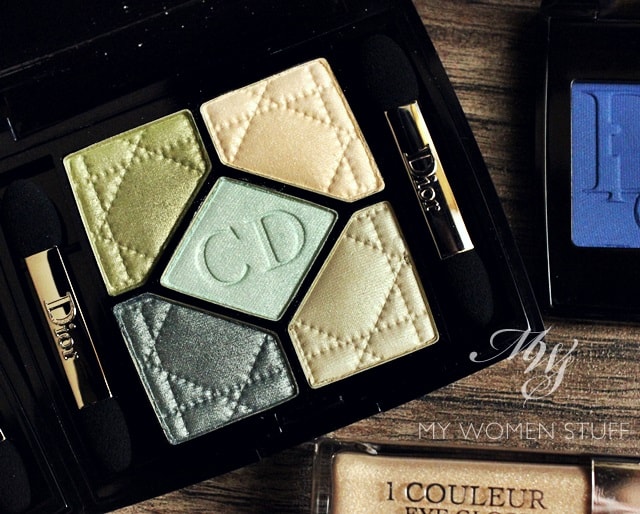
Dior 5 Couleur Eyeshadow Palette – Peacock 434
There are 2 limited edition eyeshadow palettes in this collection. Pictured above is Peacock which for some strange reason doesn’t strike me as reflecting the colours of a peacock. I do think the one labelled Blue Lagoon reflects the vibrant colours of a peacock’s feathers better.
As with other Dior quints, you can expect the colours to be light and shimmery. There is one rather glittery colour in Peacock which is the gold in the top right corner. I personally find the colours in this one very safe. The swatches will show you what I mean.
As you can see, colours are safe and light. The deepest shade serves as a crease shade or in my case, used on the outer corner of the eye and close to the lashline to define and create depth. The light shades offer a sheer wash of colour, which may not appeal to many, but which I believe reflects the essence of a Summer eyeshadow palette. You don’t want strong heavy colours when the weather is hot. Just a light wash of colour to perk up the eye area. This one does the job.
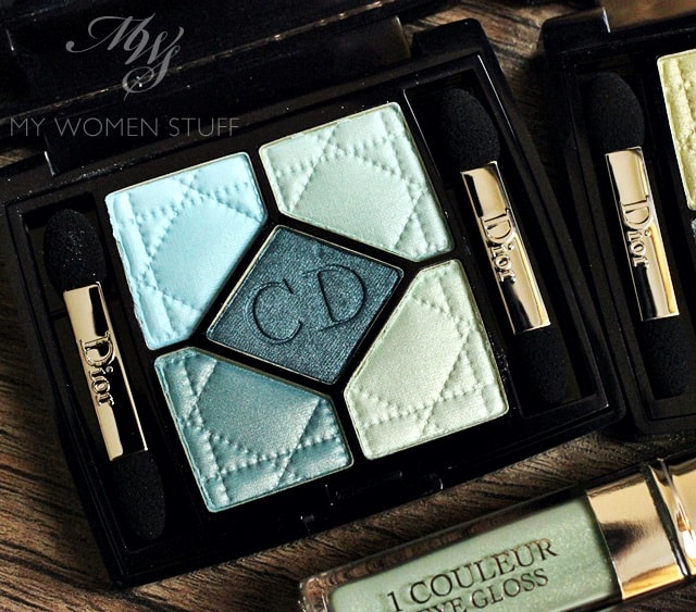
Dior 5 Couleur Eyeshadow Palette – Blue Lagoon 374
This is the other offering in the collection, a blue/teal toned palette aptly named Blue Lagoon, that brings to mind the colours of the waters in a still, beautiful, peaceful lagoon. I can just see the light shades representing the surface of the lagoon, with the shades getting deeper as we go deeper. Almost feels refreshing doesn’t it? 😀
The swatches in this one reflect slightly more variation in colour compared to Peacock so I can imagine this one will draw the eye of more people. The colours are iridescent and shimmery for the most part, but not glittery which is something I appreciate. You can actually get quite good intensity if you build up the colour, if that is a look you prefer.
TIP: here’s a trick I learnt on how to use the Dior Bird of Paradise palettes that I have tried with some other palettes too and it works a treat:-
– Apply an eyeshadow base of your choice (Or you can use the Dior Eye Gloss)
– Use a fluffy blending brush and run your brush over all the light colours of the palette. In Blue Lagoon, draw a circle with the brush, avoiding the centre colour. In Peacock, draw a triangle, avoiding the deep colour on the lower right.
– Tap off excess and apply the blended colour to your lid. Line with black liner, mascara and go!
This is a very quick and very easy way to wear the colours of both the palettes and what you get is a very lovely wash of colour for your lid. For your reference, here’s how it will look on me.
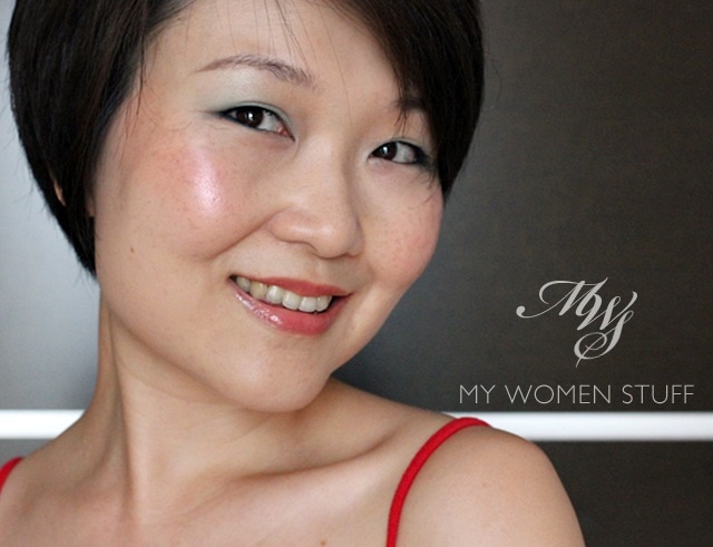
Wearing: Dior Blue Lagoon eyeshadow palette used as a wash of colour on lid and lower lid lined with the middle blue shade, tightlined with Guerlain Kohl pencil and Diorshow Iconic Overcurl mascara, Cheeks are Benefit Cha Cha Tint layered with Estee Lauder Tease and Lips are Dior Addict Lipgloss in Diablotine. Skin is prepped with Revlon Colorstay Liquid Foundation for Oily-Combination skin in 200 Nude and Nars Radiant Creamy Concealer in Vanilla Light 2
See how the eyeshadow isn’t garish or too bright at all? It allows you to wear bright colours very easily and you can deepen them as your confidence level increases. If you like, I’ll show you a picture tutorial on how you can achieve this (I’m getting the hang of this tutorial business, as you can tell hehe…) What I also realised is how beautifully the wash of colour from Blue Lagoon makes brown eyes really pop (in popular blogging vernacular) I decided to show you this neat trick because there are lots of pictures online showing you just how beautifully intense the colours of the eyeshadow palettes can look but not all of us may want or dare to wear something that intense. This way, you get your dose of colour and look pretty and fresh all at once. Tip is credited to the Dior Pro-team artist Junior Cedeno who is a fountain of information and I’ve been sharing them as I go, as you may have noticed 🙂
Dior 1 Couleur Eye Gloss in Bamboo and Golden Sand – RM102
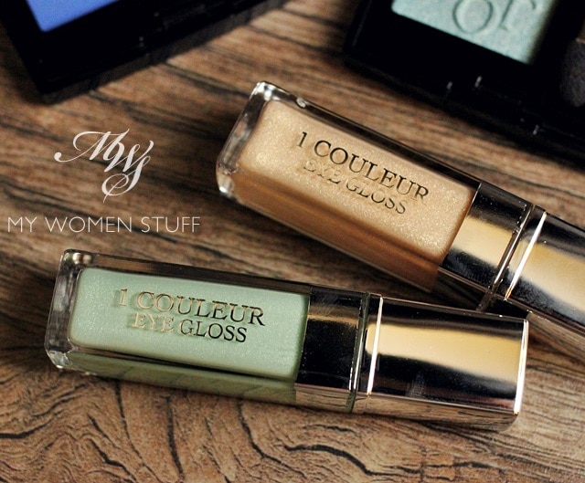
There are 4 shades of the 1 Couleur Eye Gloss but pictured are just 2 – Bamboo (mint green) and Golden Sand (gold). These were introduced by Dior last year and Dior has reintroduced them this year in 4 new colours. The ones not pictured are Outremer, a shimmer teal and Zenith, a peachy bronze. You can see the 4 colours in this picture.
These give lids a very light hint of colour and sparkle, and a cooling sensation on skin. I’m not crazy about them if I’m to be honest. Mint green isn’t a colour I wear often. However, I went out and bought Golden Sand because I was taught that you can use it not only as an eye makeup base, but also as an illuminator for your skin. So, if you are going somewhere lovely this Summer and don’t want to carry a ton of stuff, carry Golden Sand.
TIP: You can mix Golden Sand with your favourite BB Cream or liquid foundation and turn it into a skin illuminator! Apply it under your eyes or on your cheekbones to give a glow to skin. It has to be seen to be believed, trust me 😀 Think of it as a DIY Dior Skinflash (my hey-I’m-alive product).
Dior Mono Eyeshadow in Parati 273 and Feather 351 – RM105
I told you my thoughts on the new Dior Mono Eyeshadows previously and Dior were quick to add 2 new colours to the line. I do believe they are limited edition however.
Parati is a matte vibrant blue and Feather is a shimmery green that looks light in pan, but applies a little olive. I will have to revise my description that I shared before this, because the store lighting deceived me into thinking it was teal. It isn’t.
Like the other Mono eyeshadows, these colours can be worn wet or dry and reflect a much better intensity when worn wet. This is especially true of Parati which can be used almost like a vibrant blue eyeliner. However, I am loathe to spoil the texture of the shadow by wetting it. I might for Parati though because I can’t imagine wearing it any other way. I could perhaps treat it like a cake liner. Feather is one of those colours you can swipe on and go. Its easy and pretty and versatile and reflects everything I said in my previous review. It is one of the better textures produced.
Diorshow Liner Waterproof Aqua Green RM80
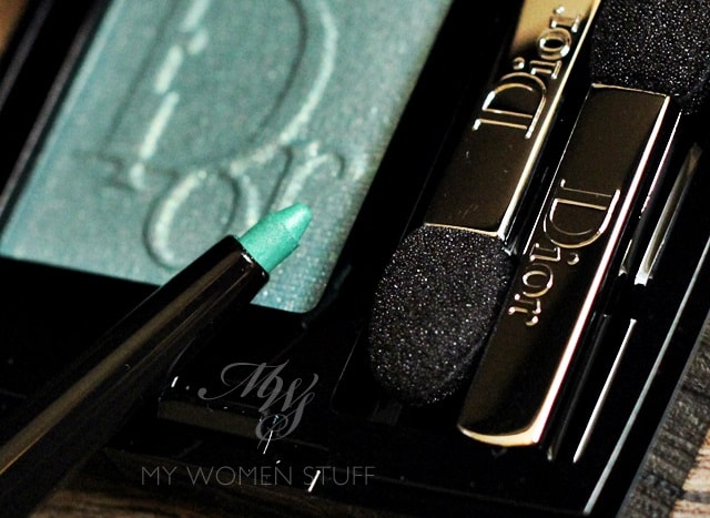
Aqua Green is an intense green eyeliner that has surprising longevity. I’ve never used Diorshow eyeliners before this, but I’m now interested to get one in black because I was very impressed with how long it lasted. Even drawn on the back of my hand, it isn’t that easy to clean off, needing a few passes of a cotton pad infused with makeup remover.
The colour is a very pretty and vibrant seafoam green that again, reminds me of a lake or the ocean. It is very pretty worn on its own, but to make it really pop, make sure you tightline with a black liner. You can also double-line, lining this colour just above a black line. Very intense, very pretty and very longlasting 🙂
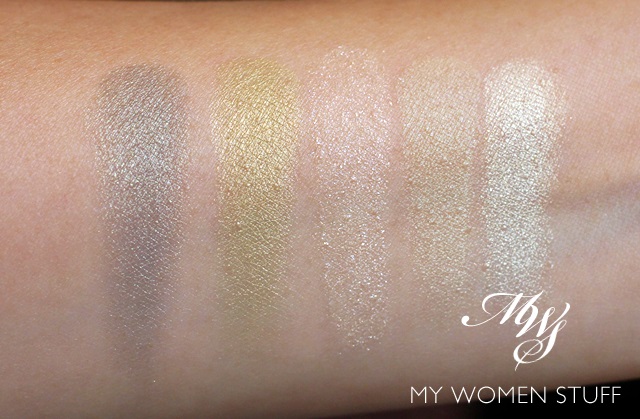
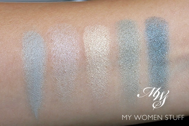
Here are the swatches of all the above.
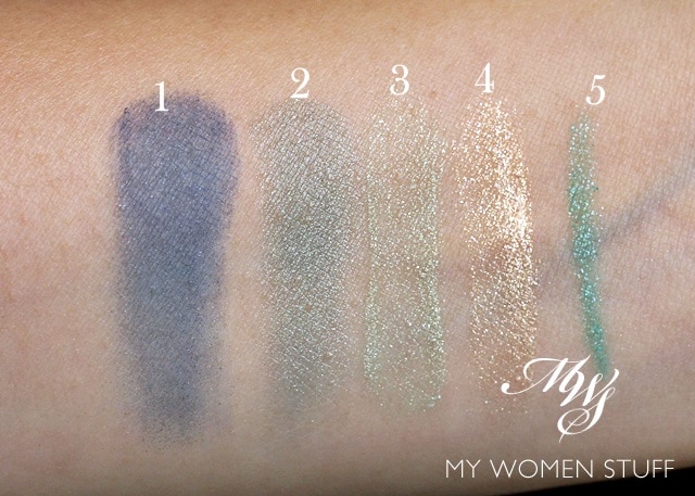
(1) Dior Mono Parati swatched dry (2) Dior Mono Feather swatched dry (3) Dior 1 Couleur Eye Gloss Bamboo (4) Dior 1 Couleur Eye Gloss Golden Sand (5) Diorshow Eyeliner in Aqua Green
I did notice that the Dior Mono in Feather had a close similarity with the olive green shade in the Peacock palette so I placed them side by side for a quick comparison. They are both very lovely colours and if this is the only colour you want then you may not need the whole palette.
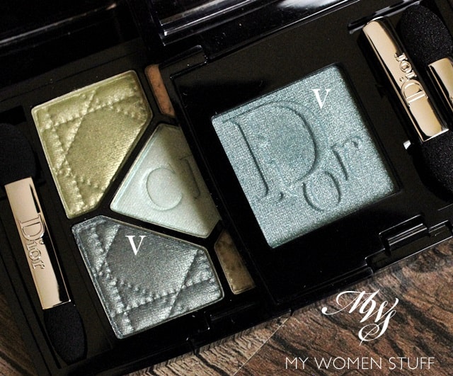
The colour in pan when placed together looks different. The colour in the Peacock palette looks more grey-green while Feather looks more green-green.
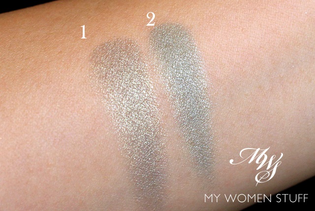
(1) Olive green from Peacock palette (2) Dior Mono in Feather
Swatched side by side, I do think they are close enough in shade. Feather does have a more green tint to it, while the colour in Peacock has a more grey-green vibe that I find reminiscent of colours like that in the infamous Lancome Erika F. It is one of those colours that look best worn alone because they are special enough.
In a nutshell
I like the angle Dior has taken with their Summer collection this year. I especially like that they aren’t shoving us more bronze, brown and orange shades which clash appallingly with my skintone although I know it looks amazing on many warmer or golden skintones. I just am not one for bronzey shades so the Dior Bird of Paradise collection has wowed me in this regard. The eye products in the collection are varied and while I’m not crazy about the blue mono of Parati, I like Feather as a product you can easily wear alone for a very pretty look. I am also in love with the technique of using all the colours in the 5 colour palettes of Peacock and Blue Lagoon for a gentle wash of colour on the eye area for days when I don’t want or feel like wearing intense colour. The effect is natural, light and refreshing.
Pros: Interesting angle for a summer collection, Quality of products are reflective of the brand, The eyeliner is seriously impressive in terms of longevity, The eye colours are refreshing and can be built up for intensity or worn as a refreshing wash of colour without looking chalky or too sheer
Cons: Limited Edition
Who will like this: Anyone who likes wearing sea toned colours on the eyes
Do these eye colours catch your fancy? Have you checked out anything from the Bird of Paradise collection?
My favourites are the 2 eye palettes in Blue Lagoon and Peacock, Feather Mono eyeshadow, Golden Sand eye gloss for skin illumination and the Diorshow liner, less so for the colour but more for the quality of the product. I’m going to get one in black and let you know what I think of that! 😀
Paris B
Dior Summer 2013 Bird of Paradise collection eye makeup prices are as shown above. Available at all Dior counters for a limited time only
Other items reviewed in the Bird of Paradise collection (click image for post):-

Hmmm, the Dior eyeliner looks tempting. Love the colour you swatched, would be great for weekends. I have a top in the same colour as Parati so my eye was immediately drawn to it. Wonder how it looks like on the eye. . .
Parati on the eye would be mostly best suited for a smokey sort of eye look. Its rather intense that way 🙂
Love the eyeliner! And the colors on this collection are gorgeous! love your tip with the eyeshadow. 🙂
Thanks Issa 🙂 That eyeshadow trick really changed the way I look at this palette and other palettes too. It doesn’t work with every colour combination but there is potential there!
Oh I tried Golden Sand and it’s lovely! However, wouldn’t it be too shimmery as an illuminator? I have to try that 🙂
Nope, not shimmery at all 😀 Blend it and it gives a beautiful finish
The Mono Shadow in Feather=GORGEOUS! Also love that liner…I was thisclose to going back for it when I bought Coral Glow but I had to restrain myself. I’m going broke already!! 😛 haha
LOL! I can imagine, Becca! Feather is very pretty and I love wearing it just on its own because its just perfect that way 😀
I am quite the opposite in that regard . I live for warm bronzes and coppers !
The pastels wash me out 🙁 But the collection seems to be cohesive and excellent quality so hooray for dior !
And that’s why there’s a market for everyone 😀 I can’t wear warm shades – skin tone doesn’t allow it and I look dirty 🙁 I don’t wear pastels well either. I think only the very very fair can pull pastels off well. That’s not a very big market is there?!
What a thorough review, with gorgeous pics! <3
Thank you Mag 😀
The eyeliner looks very tempting! Love the Blue Lagoon palette for spring. The colours look so pretty and perfect for summer.
I somehow think the eyeliner will be something you’d like Gio since you like bright eye makeup 😉